As we step into 2024, let's explore the highly anticipated Color of the Year selections by prominent color authorities and paint companies. This year's color palette ranges from deep, somber tones to bright, peachy tones. In this post, O'lucio Home will look at five of the most significant colors, exploring the most popular color themes that will undoubtedly dominate in 2024.
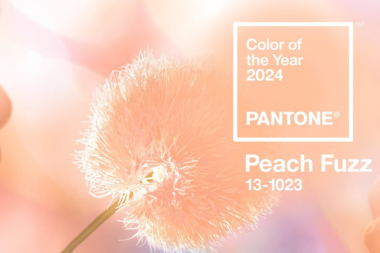
1. PANTONE 13-1023 Peach Fuzz - Pinkish-orange

Pantone announced a soft, pinkish-orange hue called “Pantone 13-1023 Peach Fuzz” as their color of the year 2024. Peach Fuzz is a combination of soft light orange and gentle pink, creating a fresh and peaceful feeling that is classic but no less modern. It is the color of silky feathers, plump fruit, or graceful satin silk fabrics. Peach Fuzz is a unique color that represents hope, coziness, and intimacy. “In seeking a hue that echoes our innate yearning for closeness and connection, we chose a color radiant with warmth and modern elegance. A shade that resonates with compassion, offers a tactile embrace, effortlessly bridges the youthful with the timeless,” said Leatrice Eiseman - Executive Director of Pantone Color Institute.
With its warmth and tenderness, Peach Fuzz is an excellent choice for home design. Adding soft and fuzzy Peach Fuzz to the interior design provides a welcoming atmosphere. Peach Fuzz adds a comfortable presence to our most personalized environments, whether it's on a painted wall, in home decor, or as an accent within a pattern.
2. Behr’s Cracked Pepper - Soft Black

On August 15th, 2023, Behr Paint Company announced that its 2024 Color of the Year is Cracked Pepper (PPU18-01), which is a soft, light black. Behr chose Cracked Pepper after completing its own research, which revealed that more than half of Americans (54%) believe black tones add "new energy and vibe" to their homes. Similarly, 57% of those questioned agreed that painting the walls a darker hue would make the property more visually appealing. The firm also sees a growing tendency toward darker colors, at least in terms of aesthetics.
“This is a color that is both classic and modern, capable of awakening the senses and spreading confidence in any situation,” Behr described. With its contrasting adaptability and dynamism, this tone will undoubtedly find its place in interior design styles ranging from minimalist to complex. The warm white pairs well with Cracked Pepper, offering a contrasting but not harsh combination for those who gravitate toward modern design. But if you love mixing vibrant colors, in your home, the black paint can easily act as a backdrop for patterned fabrics and fun furniture.
3. Benjamin Moore’s Blue Nova - Blend of Blue and Violet

Benjamin Moore has announced that their Color of the Year 2024 is Blue Nova 825, a saturated, vibrant blend of blue and violet that the brand says “was inspired by the brilliance of a new star formed in space.”. Andrea Magno and Sharon Grech, Benjamin Moore's color marketing and development team, explained that they chose Blue Nova for its balanced nature and peace of mind. "Blue Nova is a neutral color, so it's neither too dark nor too light." Grech stated.
Furthermore, this color signifies the desire for adventure and discovery, especially after many years of customers having to deal with various changes and influences from modern life. However, Blue Nova delivers relaxation and comfort, enabling people to discover peace in their own home space. The touches of red in the violet undertones ensure Blue Nova does not give off a cold sense, as sometimes exists with blue. Instead, the blue inspires us to reflect on the transcendence of the sky while still providing an underlying sense of ease and tranquility.
4. Glidden's Limitless - Deep Yellow

Limitless by Glidden is a warm neutral tone that blends with white, very light yellow, and nude. Glidden describes this creamy beige as "anything but a yellow honey beige tone.” This color conveys a sense of possibility and optimism and can be used in almost any setting. Limitless works well with palettes of whites, delicate pastels, earthy neutrals, desaturated jewel tones, and vibrant floral hues. It enhances both warm and cold tones. Additionally, it complements a range of metal finishes, such as polished silver, black, bronze, and brass.
The honey beige shade is a very happy medium for folks who want a neutral that will work in any space but still want to experiment with this color. Its subtlety, sophistication, and relaxing qualities allow Limitless to function as a supporting hue while still having enough strength to take center stage as a major color.
5. Graham & Brown’s Viridis - Green

Interior design brand Graham & Brown chose Viridis, a soft green, as its color of the year for 2024. Viridis is described by Graham & Brown as an “embodiment of fertile green hills” and a “complex yet flexible hue” that can add “depth to a space” and blur the “lines between the outside and inside.” Viridis embraces the green landscape around us, making it especially ideal for spaces that bridge the gap between outdoor and indoor, such as entertainment areas and entrances. This versatile color would look well in small settings to create a comfortable, peaceful ambiance or in larger spaces for a sophisticated look.
Sources: Pantone, Behr, Newswire, Benjamin Moore & Co, Glidden, Better Homes and Gardens, Graham & Brown, Architectural Digest
Leave a comment
This site is protected by hCaptcha and the hCaptcha Privacy Policy and Terms of Service apply.